Judging a Book by Its Cover
October 18, 2014
Herman Melville’s Moby-Dick is an American classic, as famous as Huck Finn or The Great Gatsby. It has inspired the names of the world’s largest coffee shop chain (Starbuck was a Moby-Dick character), at least one psychadelic rock band, an electronica musician, and in all likelihood, countless whale-shaped adult toys. And while few people know who Ishmael is, everyone knows what he wants us to call him.
Initially, though, the book was a failure. It was long and meandering, and punctuated by technical passages describing the mundane details of whaling ships, whaling tools, whale diet, and the handling of whale carcasses. Reviewers found this structure weird. Melville, who believed Moby-Dick to be his greatest work, was crushed. It only sold 3200 copies during his life.
Some say he was ahead of his time, and it was only with the rise of modernist novels in the early twentieth century that Moby-Dick began to make sense. Others say that the senselessness and shattered reality of the First World War provided a new context for such a fragmented book.
Then there was also Rockwell Kent.
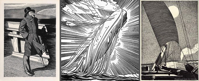
Kent is one of those marginally famous artists you’ve probably never heard of. Born in 1882, he was initially associated with the Ashcan School, a group of dirt-and-all urban realist painters clustered in New York City shortly after the turn of the twentieth century. He soon gave this up and moved to Monhegan Island in the wilds of Maine, where he built a log house with his own hands and painted the Adirondacks wreathed in the glow of the summer sunset. Kent was a Transcendentalist, a socialist, and a vegetarian before that was a thing. He married several times, and had affairs with local women. He created a nerdy-looking alter ego named “My Better Self.” Saying that he wanted to paint “the rhythm of eternity,” he went on artistic sojourns to the most remote corners of the Earth: Tierra del Fuego, Greenland, Alaska. He wrote six memoirs.Rockwell Kent, in short, was probably obnoxious.
But he was also one of the most gifted illustrators of the twentieth century, and his drawings for the 1930 printing of Moby-Dick are his best work. When publisher R.R. Donnelly asked Kent in 1926 to illustrate Richard Henry Dana’s Two Years Before the Mast (Have any of us heard of this book? Probably not, perhaps because Kent didn’t illustrate it.), he suggested Moby-Dick instead. It’s unsurprising that he loved the book, since it encapsulates many of the values he held dear: the awesome power of nature, Man as nature’s worthy adversary, ruggedness, the thrill of the unknown, and a general machismo.
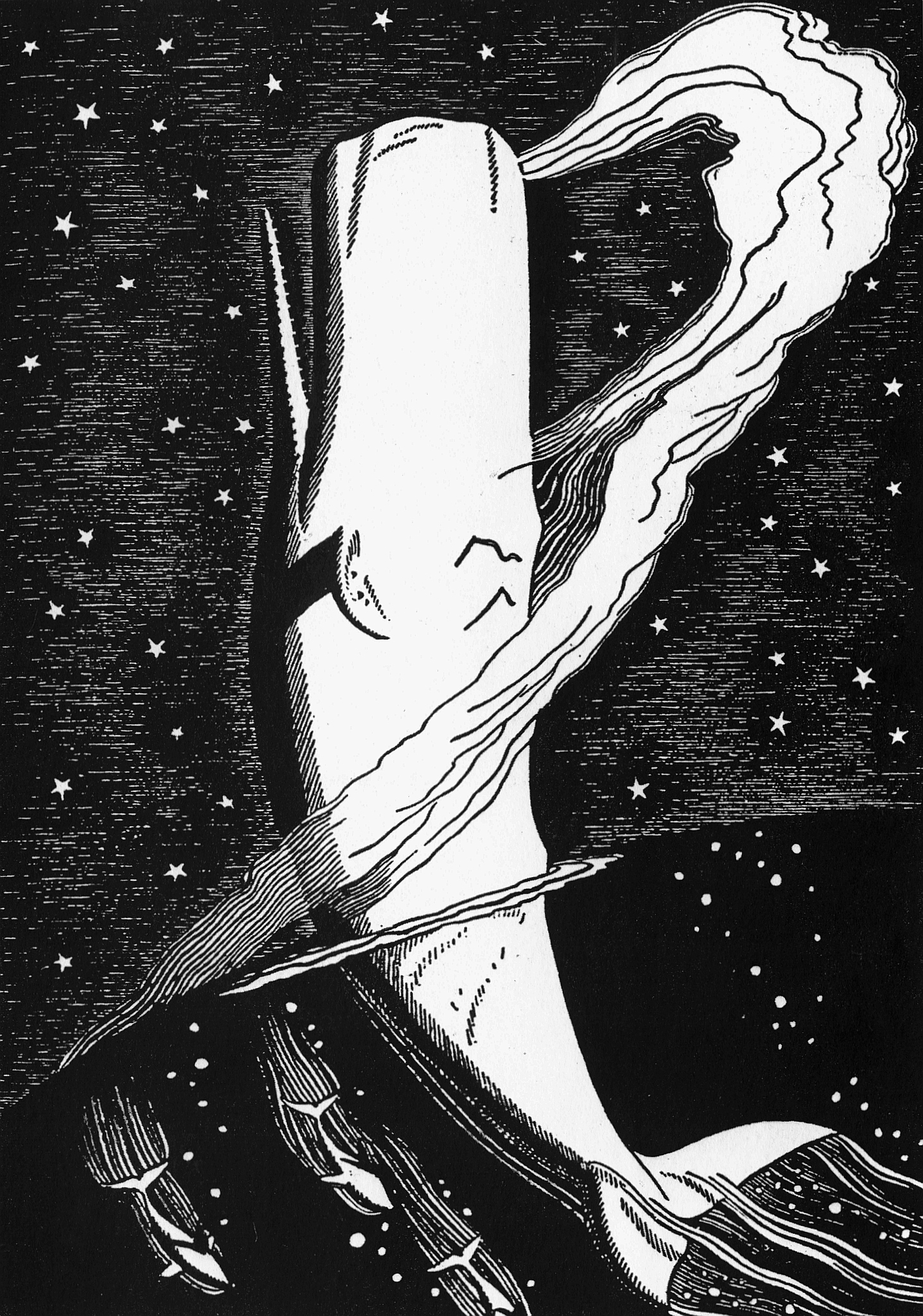
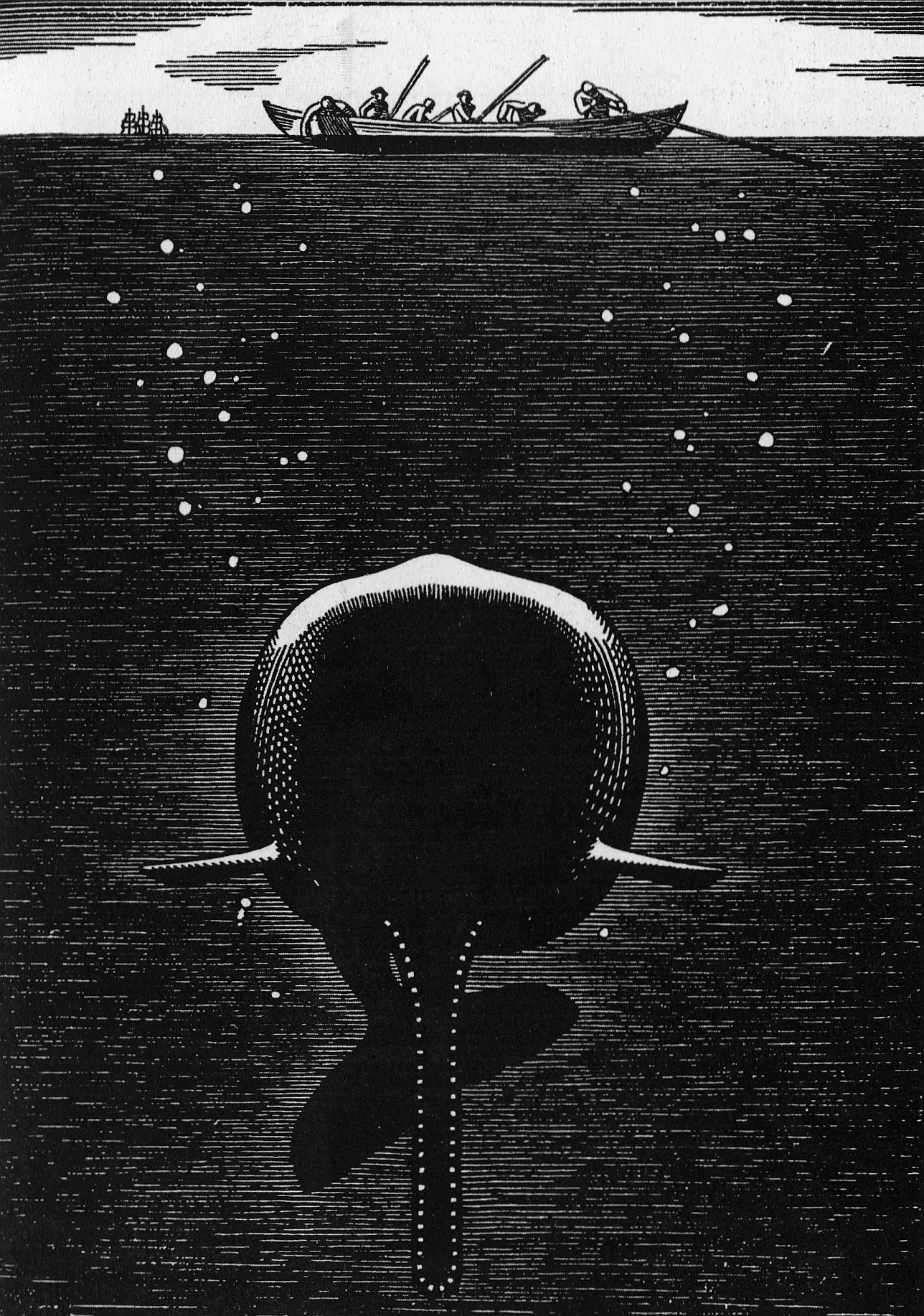
All of these are plainly obvious in the drawings he produced. Kent’s style, wedged between the hard-edged Art Deco glamour of the 1920s and the flowing dynamism of 1930s American Scene art, glorifies both the Pequod’s sailors and the albino sperm whale they hunt. All are in sharp relief and are seen from a low, aggrandizing point of view.
It’s clear that Kent is rooting for the whale as much as he is for the sailors (and probably more). Moby-Dick himself is lovely, free, and immensely powerful. In the end, the Pequod’s crewmen are sitting ducks, and the whale, lurking below the surface and ready to strike, is not just Ahab’s nightmare but everyone’s.
The limited edition printing with Kent’s illustrations sold so quickly that Random House published a trade version. It’s a striking volume, one of the outstanding uses of imagery in a decade known for outstanding book design. As far as I can tell, Moby-Dick has never been out of print since.

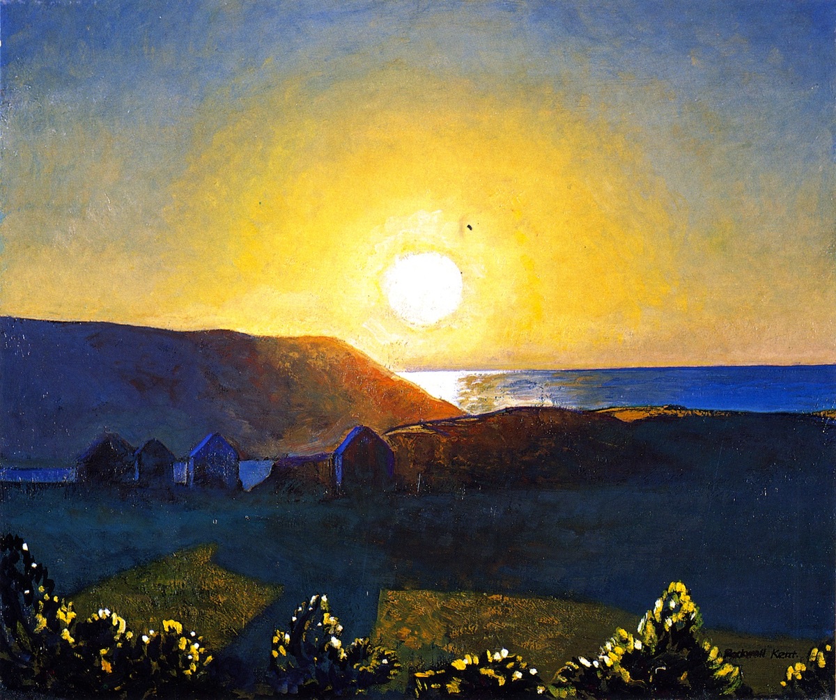
Lately I’ve seen a fancy new hardcover version of the book with Kent’s whale embossed on the front cover. In the context of today, his carefree depiction of nature’s glory seems quaint. Sperm whales were hunted almost to extinction, and the oceans have become garbage dumps.
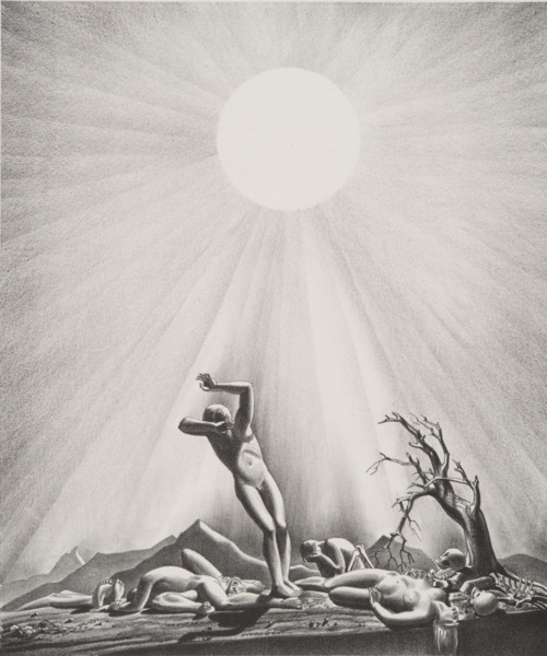
Kent’s images encapsulate a certain innocent optimism about humanity’s potential—and our relationship with nature—that is impossible to hold onto now. In 1937 Life magazine commissioned him to produce a series of illustrations depicting potential causes of the end of the world. This sounds terribly pessimistic, I know, but the series is also amazingly optimistic in that none of the four calamities (Solar Flare-Up, for instance) have anything to do with human fallibility. They’re all cosmic disasters beyond our control. The people are still noble, even if they’re dead.
Perhaps this explains the continued appeal of Moby-Dick: nostalgia for a world in which nature can defeat us, rather than the other way around.